https://makmak0070.tistory.com/20

# install
!pip3 install pdpbox
!pdp3 install xgboost == 1.7.2
!pip install category_encoders
pip install --upgrade matplotlib

import pandas as pd
import numpy as np
import matplotlib.pyplot as plt
import seaborn as sns
from sklearn.model_selection import train_test_split
from xgboost import XGBRegressor
from sklearn.metrics import mean_absolute_error, mean_squared_error, r2_score
from category_encoders import OrdinalEncoder
from sklearn.pipeline import make_pipeline
from pdpbox.pdp import pdp_isolate, pdp_plot
from pdpbox.pdp import pdp_interact, pdp_interact_plot
%config InlineBackend.figure_format='retina'
# 데이터 셋 불러오기
df_init = pd.read_csv('audi.csv')
df_init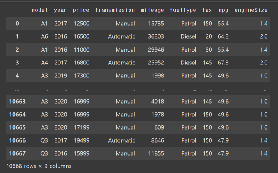
df_init.describe()
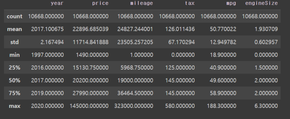
75%와 max 값이 차이가 많이 난다
가격도 최소와 평균 , 최대값이 이상하다
# 피쳐 요약표
# 사이즈 확인, 데이터 타입, 결측치, 고유값 개수, 1~3번째 값

import matplotlib as mpl
import matplotlib.pyplot as plt
import seaborn as sns

def resumetable(df):
    print(f'dataset shape: {df.shape}')
    summary = pd.DataFrame(df.dtypes, columns=['data type'])
    summary = summary.rename(columns = {'index' : 'feature'})
    summary['number of missing value'] = df.isnull().sum().values
    summary['number of unique data'] = df.nunique().values
    summary['first value'] = df.iloc[0,:]
    summary['second value'] = df.iloc[1,:]
    summary['third value'] = df.iloc[2,:]

    return summary

resumetable(df_init)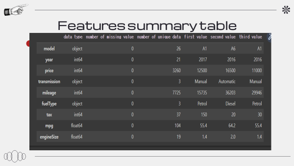
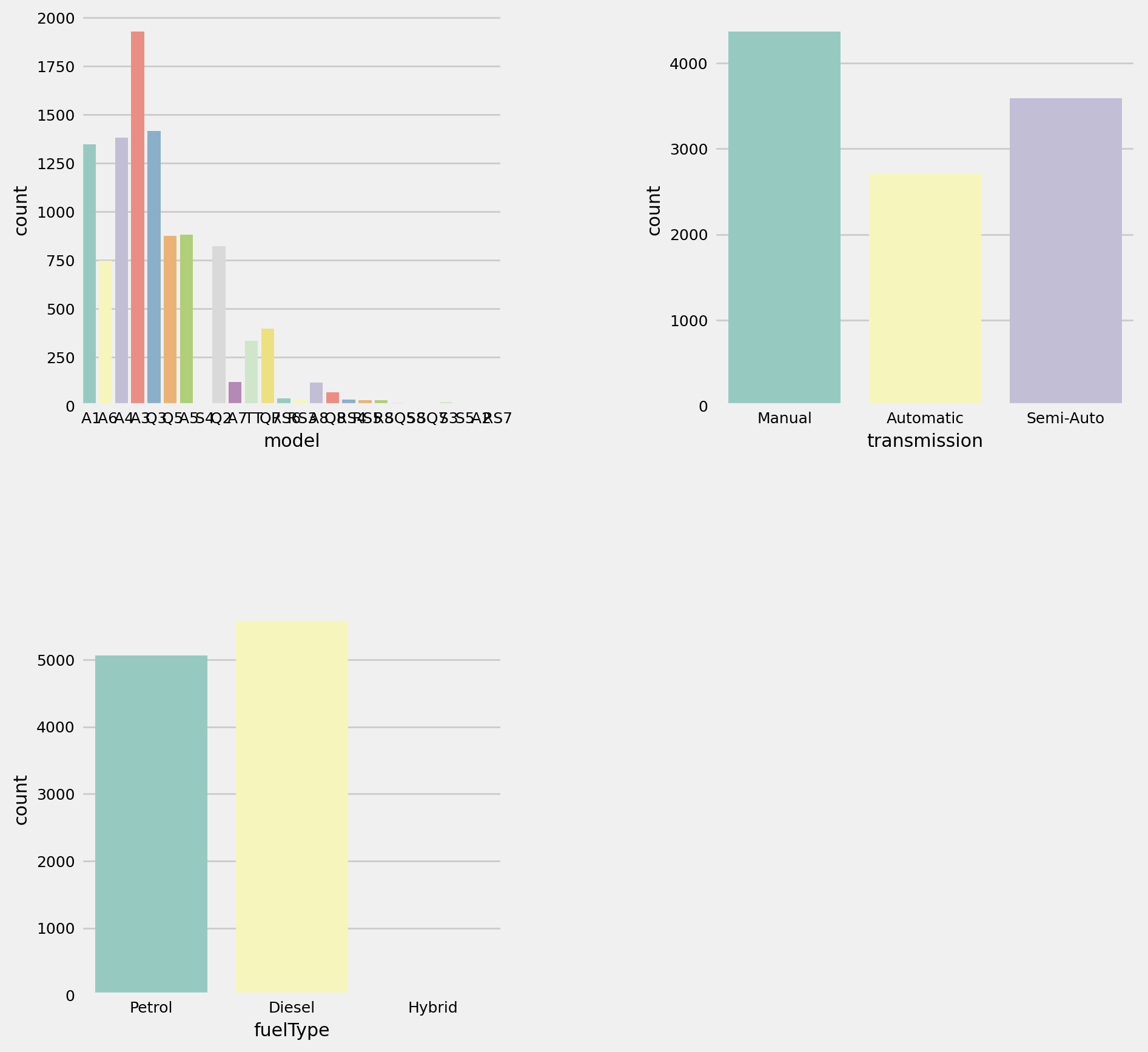
# 그래프 설정

import matplotlib.gridspec as gridspec

def plot_by_features(df, features, num_rows, num_cols, size=(12,18)):
    mpl.rc('font', size=9)#폰트
    plt.figure(figsize = size) #사이즈
    grid = gridspec.GridSpec(num_rows, num_cols) # 격자 개수 2*2
    plt.subplots_adjust(wspace = 0.5, hspace = 0.5) # 그래프 간의 사이 여백

    for idx, feature in enumerate(features):  # enumerate(features) -> index, value:1, model / 2, transmission
        ax = plt.subplot(grid[idx])
        sns.countplot(x=feature, data = df, palette = 'Set3', ax= ax)
# 그래프로 데이터 살펴보기
temp_list = ['model', 'transmission', 'fuelType'] #피쳐
plot_by_features(df_init, temp_list, 2, 2, size =(10, 10))
fig, axes = plt.subplots(nrows=3, ncols=2, figsize=(10, 12))

sns.scatterplot(x='price', y='year', data=df_init, ax=axes[0, 0])
axes[0, 0].set_title('Scatter Plot of year vs. Price')

sns.scatterplot(x='price', y='mileage', data=df_init, ax=axes[0, 1])
axes[0, 1].set_title('Scatter Plot of mileage vs. Price')

sns.scatterplot(x='price', y='tax', data=df_init, ax=axes[1, 0])
axes[1, 0].set_title('Scatter Plot of tax vs. Price')

sns.scatterplot(x='price', y='mpg', data=df_init, ax=axes[1, 1])
axes[1, 1].set_title('Scatter Plot of mpg vs. Price')

sns.scatterplot(x='price', y='engineSize', data=df_init, ax=axes[2, 0])
axes[2, 0].set_title('Scatter Plot of engineSize vs. Price')

fig.delaxes(axes[2, 1])

plt.tight_layout()
plt.show()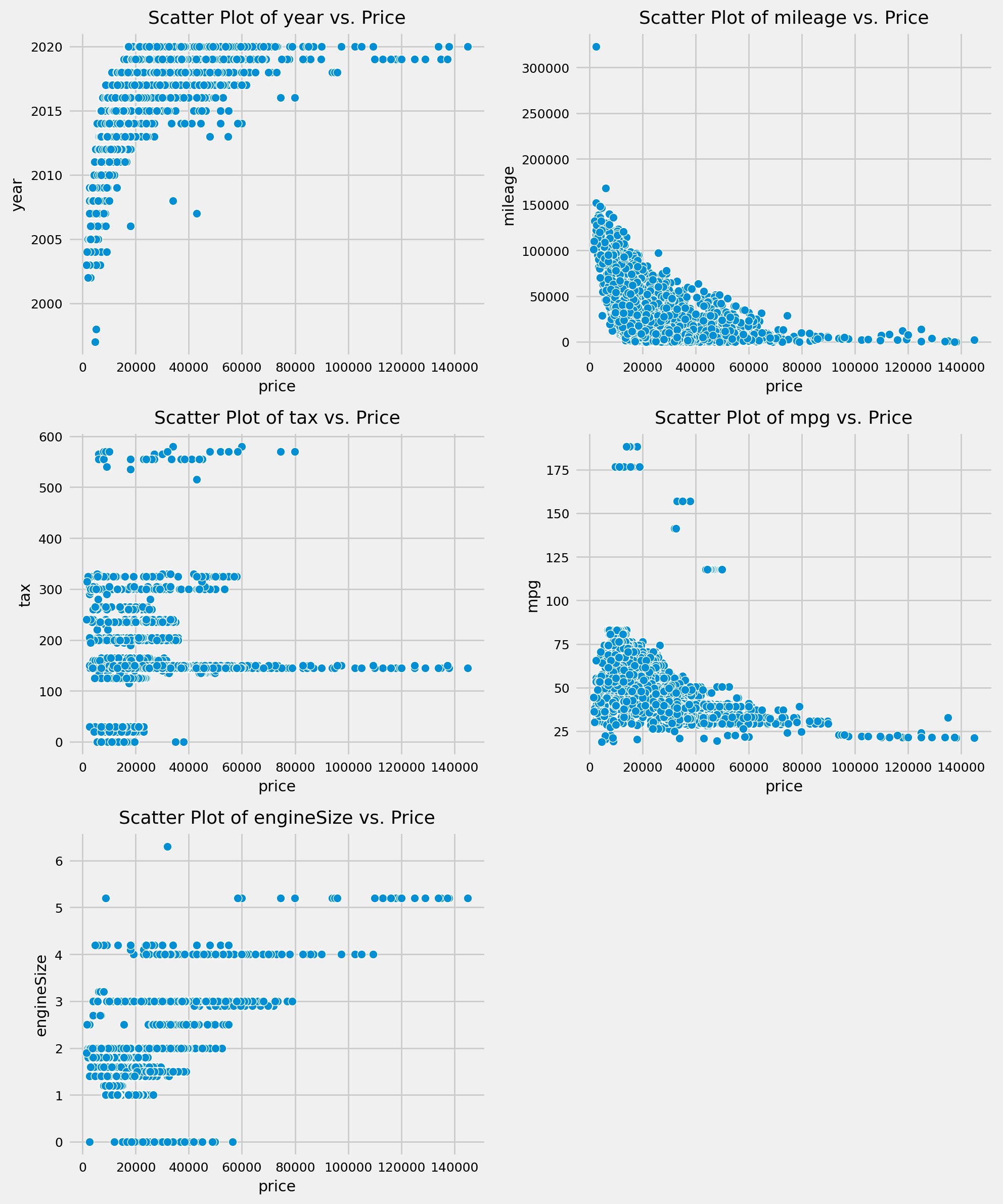
상관계수 확인하기
sns.heatmap(data = df_init.corr(), vmin = -1, cmap='coolwarm', annot = True);인덱스 재정렬
df_init = df_init.reset_index(drop = True)
df_init
인코딩
from sklearn.preprocessing import OrdinalEncoder

ordianl_encoder = OrdinalEncoder()

ordinal_data_encoded = ordianl_encoder.fit_transform(df_init[temp_list])
df_ordinal = pd.DataFrame(ordinal_data_encoded)
df_ordinal.columns = temp_list
df_ordinal
수치형 데이터로 변환 --> 변환시키는 이유는 데이터 서로 간의 관계성이 생기기 때문이다
{index: label for index, label in enumerate(ordianl_encoder.categories_[0])} #model{index: label for index, label in enumerate(ordianl_encoder.categories_[1])} # transmission{index: label for index, label in enumerate(ordianl_encoder.categories_[2])} # fuel typedf_init.drop(temp_list, axis=1, inplace = True)df = pd.concat([df_init, df_ordinal], axis =1 )
df다시 상관계수 확인
sns.heatmap(data = df.corr(), vmin = -1, cmap='coolwarm', annot = True);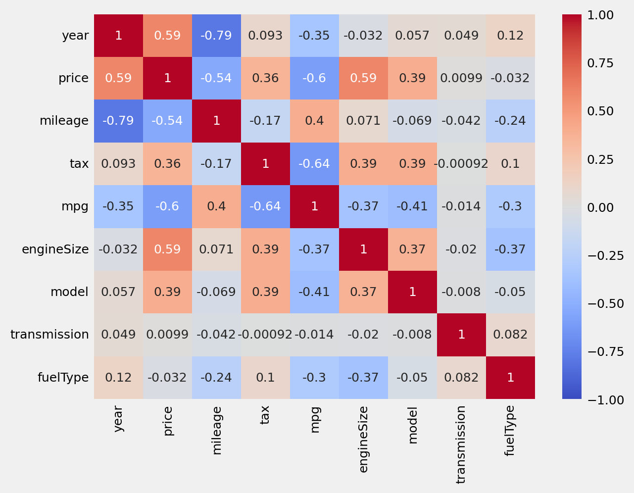
베이스 모델
df = pd.get_dummies(df,columns=['model', 'transmission','fuelType']).copy() # 더미 데이터x_data = df.drop('price', axis = 1)
y_data = df['price']
# min max 조정
from sklearn.preprocessing import MinMaxScaler
scaler = MinMaxScaler(copy=True, feature_range=(0, 1))
x_data = scaler.fit_transform(x_data)
x_data = pd.DataFrame(x_data)from sklearn.model_selection import train_test_split
X_train, X_test, y_train, y_test = train_test_split(x_data, y_data, test_size = 0.1, random_state = 97)
X_train = X_train.reset_index(drop=True)
X_test = X_test.reset_index(drop=True)
y_train = y_train.reset_index(drop=True)
y_test = y_test.reset_index(drop=True)
print(X_train.shape)
print(X_test.shape)
print(y_train.shape)
print(y_test.shape)from sklearn.linear_model import LinearRegression
regressor = LinearRegression()
regressor.fit(X_train,y_train)
print('Accuracy on Testing set: %.1f ' %(regressor.score(X_train,y_train)*100))results = X_test.copy()
results["predicted"] = regressor.predict(X_test)
results["actual"]= y_test
results = results[['predicted', 'actual']]
results['actual'] = results['actual'].round(3)
results['predicted'] = results['predicted'].round(3)
results성능 향상
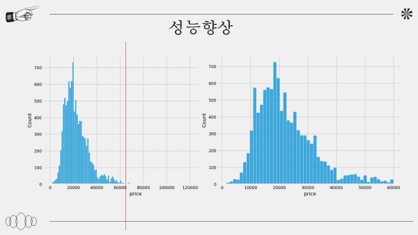
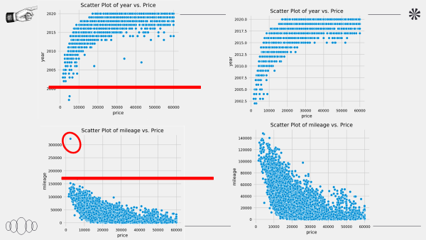
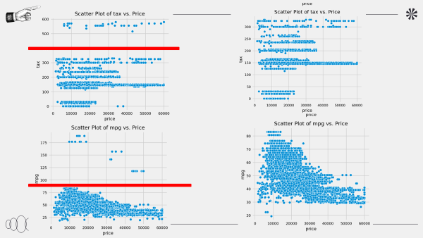
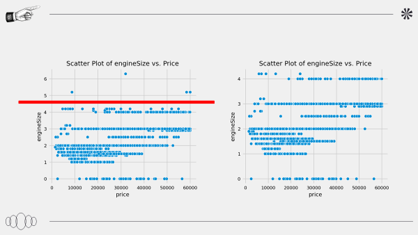
가격 및 각 데이터의 이상치 확인하고 제거한다
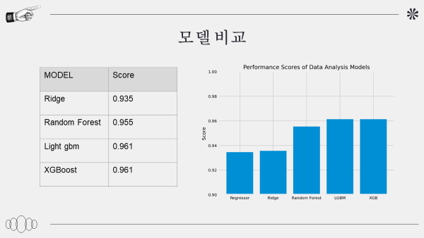
모델 비교
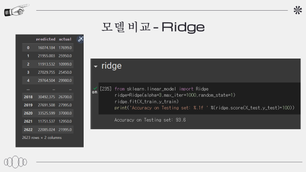
릿지 : 93.6
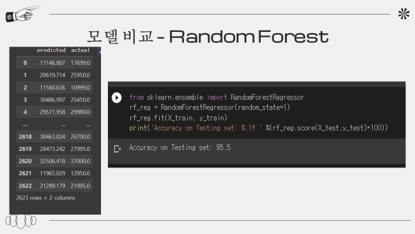
랜덤 포레스트 : 95.5
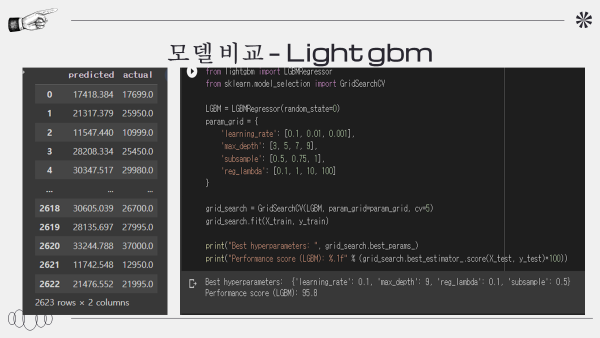
light gbm :95.8
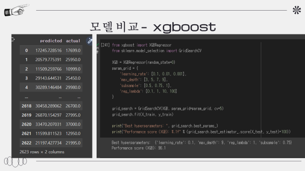
xgboost: 95.1
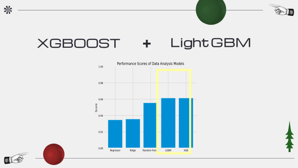
xgboost + light gmbm = ensemble model
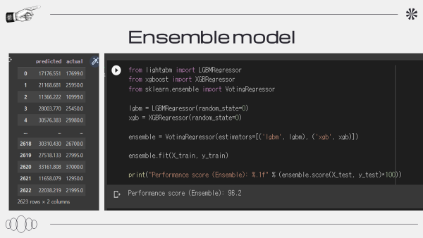
앙상블 모델의 점수는 96.2점으로 제일 높은 것을 확인할 수 있다
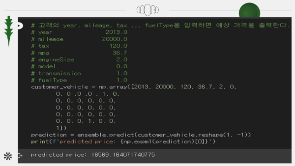
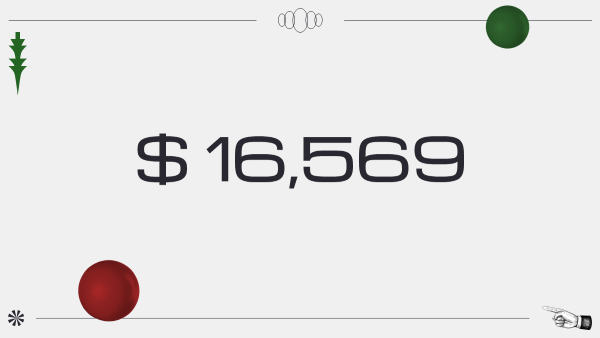
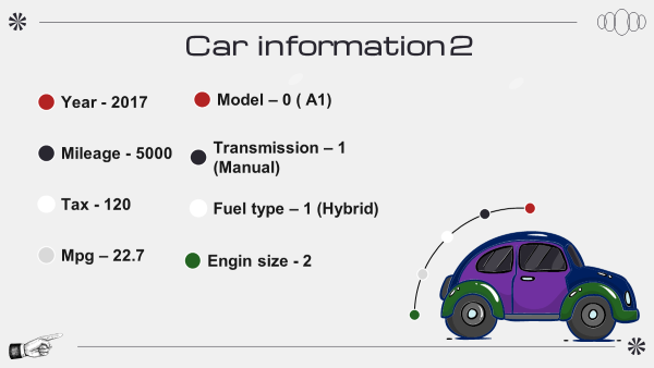
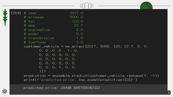
가격 예측

PDP

특성 중요도
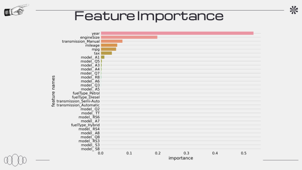
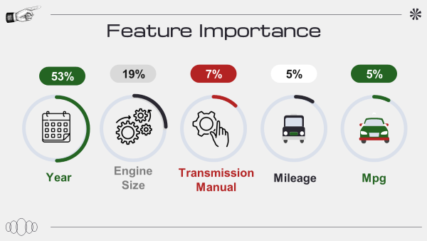
년식이 제일 중요한 것을 확인
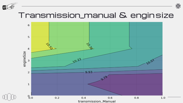

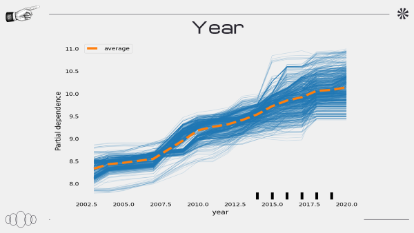
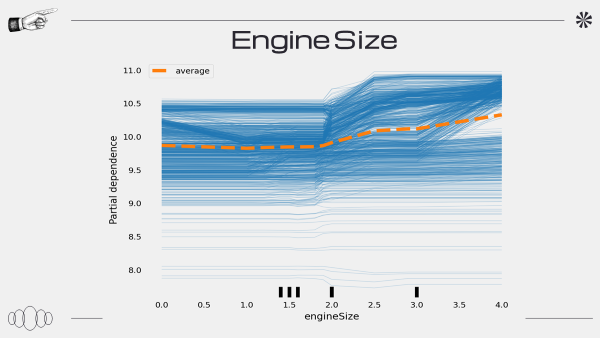
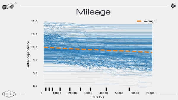
PDP 그래프를 도출하는 과정에서 문제가 생긴 것 같다
또한 PDP 해석하는 것에 있어 공부가 필요하다
동기들의 피드백에서는 문제를 설정, 가설 설정하는 부분이 없어 아쉽다는 평을 들었다
'데이터 분석 및 프로젝트' 카테고리의 다른 글
| SELECT 문 실행 순서 / CASE/ SUBQUERY/IN NOT IN /FROM (0) | 2023.05.23 |
|---|---|
| SQL 내장 함수 (0) | 2023.05.23 |
| N111a- 과제 (0) | 2023.03.16 |
| section1 project- 비디오 게임 데이터 분석 (0) | 2023.03.13 |
| CLT - N122 (0) | 2023.02.25 |